STATUS: Three issues resolved–finally! This makes it a great day.
What song is playing on the iPod right now? MIDNIGHT TRAIN TO GEORGIA by Indigo Girls
This is actually a fun rant today because this cover issue was literally happening this week as I was writing these past three blog entries.
It doesn’t get any more immediate then that. Not to mention, you get a sneak peek at a gorgeous, gorgeous cover and I’m in the mood to share it.
As most of you may know (or you might not), cover design happens way in advance of when a book will be published. Mainly because the cover image and back cover copy need to make it into the sales catalog so the sales team can share with booksellers so orders can be placed, etc.
So this work, THE WINTER PRINCE, won’t actually be pubbed until spring of 2007 and yet, this week, we were dealing with the cover.
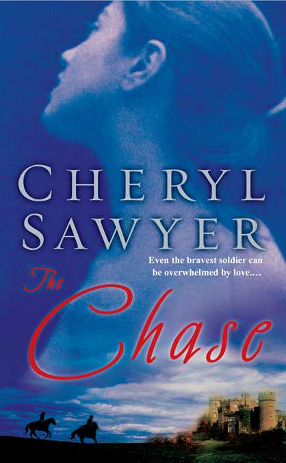
First, I must share all of Cheryl’s covers because huge kudos to New American Library. I have been blown away by every cover they have done for her. Seriously. I don’t think they can get any more gorgeous and then voila, THE WINTER PRINCE cover hits my inbox.
Now, I’m sharing all of Cheryl’s prior covers because I want you to pick up on something that should be quite clear. There is a certain look NAL is striving for in terms of branding Cheryl.
Her first two books were mass market originals and then with THE CODE OF LOVE, Cheryl made the leap to original trade paperback.
Here are the covers. What kind of adjectives leap to mind when looking at them? What do you see in common in terms of a look or feel? Share with me.


Now, here’s a first peek at the cover for her next novel.
Gorgeous. Without a doubt. So what’s up? Why were we having an issue this week with the cover? Well, there was one main reason. Cheryl writes epic historical fiction with a meaty romance embedded in the story.
Given the amount of time spent on research and the attention to historical detail in her stories, it’s important for the work to be pictorially accurate. This image struck us as regency in feel.
THE WINTER PRINCE is set in 1642-1644, right as the civil war is beginning in England (pitting parliament against the crown) and King Charles I will be beheaded to make room for the non-royal usurper Oliver Cromwell.
A regency look is pretty misleading and since we are talking serious epic historical here, we really needed the cover image to match the time period. Luckily, her publisher agreed. Even though the image is taken from a painting, it was adjusted to fit the needed time period (oh the amazing possibilities of digital editing).
Here’s the final cover.
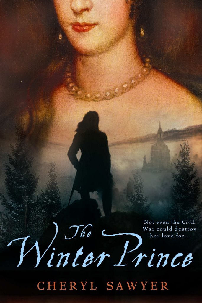
Also, there’s another change in the cover. Did you catch it?
The only difference I could catch was that the man’s hair is longer.
Adjective for covers? Distant.
I think the earlier two covers have a lovely, dreamlike quality. The later, darker ones seem to me to have a stiff formality, based as they are in 18th Century portraiture (e.g. Gilbert Stuart’s paintings of George Washington).
The revised male silhouette in the new cover made me think, “Ah, Russell Crowe as Lucky Jack Aubrey.” Not a bad thing. Not at all.
The man looks like less of a country gent and more military. Not sure why. Could be the Founding fathers hair do. For me adjective: mystery, layers,
Very beautiful and they do have a branded feel as they look to me like they belong together. Also score one for you- I’ve just added her to my “to read” list.
The lady isn’t sprouting mountains, or molehills, on her bosoms any more!
They’re all lovely, very moody and romantic. I would totally pick up one of those.
In fact, I just might!
(And I only noticed the different hair on the man, too.)
Really is a gorgeous cover. Here’s my question – when I looked at them larger and closer, is it just me or does it look like there’s a crucifix in the lower left hand corner fading into the trees? Totally hard to see but for some reason that image (or idea of the image if no one else sees it) just popped out to me.
Yeah, the mountains are gone, the “building(s)” is moved a little to the left, making it more visible to the eye as it isn’t hidden behind the tree any more. And…I looked at some Regency Period women’s portraits and they are posing more loose, which means a lot of them have a coy smile of some sort. Now, it could be my idea but I think the upper lip on the first cover has a little bit of that smile, while in the second cover the expression is more “strict”. Other than that I have no idea what exactly the regency look you didn’t want actually was and now isn’t.
The first two covers–ethereal.
I liked the later two more, though. A very authentic feel. It’s nice the artist didn’t skinny up the heroine. And the fact that you can’t see her eyes–wonderfully mysterious, like a Monica Bellucci hiding behind her fan in Brotherhood of the Wolf.
And absolutely, Joanr16, I’d pounce on Russell Crowe in any of his roles (except himself–too cranky). 😉
I noticed the lack of mountains and the man’s hair change, but the feel of the cover remains the same. One thing I did notice is that the author’s name is nowhere to be seen. Hopefully that’s a later addition. 🙂
Ethereal, temporal…very nice, very mood-setting…I like the art, personally 🙂 Yeah, the man’s hair is longer in those pony-tail things (not a historical writer, so i don’t know what they’re called)…and I saw the author’s name?
Erm…yes it is. At the bottom of both covers
Must be my old, crappy monitor, then. Or Windows Explorer. But I still can’t see that name. Think I’ll switch to Firefox to see if it shows up.
I am so screamingly jealous of this cover! I didn’t see a problem with the first cover, but I’ll wholeheartedly agree that the second one is even better. The woman felt right, but the silhouette of the man was “off” (coat he’s in feels VERY early Victorian to me; very Gothic). And I like it better without the mountains on her chest.
Serene, at first glance. Then intriguing as I take a closer look. The setting and the character tell a story in itself. Hopefully, they match the details in the book. It’s a bit distracting when the person on the cover looks nothing like the character. Just my humble opinion.
I definatly think ‘historical’ when i see the covers, especially with the last two. And I love them and I think I shall buy them. They are beautiful!
Go, Caspar David, go!
It’s amazing and wonderful to see cover artists use and modify old paintings so unashamedly in our time 🙂
I’m almost sure the background is from a Caspar David Friedrichs painting, too, but I might be wrong.
I like the covers. They make me think of people who are missing friends and lovers who are far away.
I think of Ophelia when I look at the first cover. I wonder who drowned her. The second cover doesn’t do anything for me, but it’s kinda dreamy, I guess. The last two I would just say “historical romance” and walk away. Not my kind of book, although the covers are very well done.
I noticed the guy’s hair and the building moved/mountains gone, but the changes mean nothing to me in terms of historical accuracy. I just don’t read/know anything about that period.
All of these are gorgeous. Elegant, historical feel with luscious details that suggest lyric, romantic prose.
Don’t usually read this kind of thing, but the cover alone makes me want to seek it out.
The silhouette has longer hair and a different style of dress.
It looked to me like the man was burying his face in her cleavage in the first cover, but the effect is lessened/removed in the second one. I wonder if removing the mountains helped with that? Also it is interesting that the author’s name was very prominent on her first two books but is kind of hiden on the second two. Is that to give it a more historical less romatic feel, or is it just that it is more important to sell the name in early works?
Also–art style (moody colors and contrast) and font seem to suggest that Code of Love and Winter Prince are related somehow, versus the first two (whose covers are lighter and less evocative).
I noticed his hair changed to that of a cavalier. I didn’t notice the mountains were gone until someone above pointed it out.
Absolutely beautiful cover. I have to agree…NAL makes some of the most beautiful covers I’ve seen.
This comment has been removed by a blog administrator.
This comment has been removed by a blog administrator.
for those not in the historical know: the man’s hairstyle on the revised version marks him as a Cavalier, a partisan of the king.
None of these covers say “my kind of book” to me; but the “blue period” ones have a dreamy, pseudo-fantasy quality; while the Code of Love and Winter Prince covers have a more pretentious, erm, richer and weightier feel-they do say “I am a meticulously researched historical, dangit” rather loudly. I avoid “important looking” books on general principle, unless I know the author or read a review that intrigued me, but I’m sure these are attractive to people who follow this genre.
The man’s hair is longer in the second/final rendition…..all the covers are evocative and look like historical fiction, not historical romance =) Frankly, I think they’re great covers.
The second is better, for a non-historical reason too: because the Freidrich painting is so famous, it puts the emphasis on the man. Now the emphasis is on the woman.
Who is the cover artist? They are absolutely gorgeous covers.
NAL does amazing covers. Absolutely every one of them catches my eye as I enter a bookstore–I can always tell their covers.
And I’m not just saying that ’cause they did a great job on mine–I always gravitated toward them before I realized they were all NAL covers.
Cheryl’s covers are gorgeous. Amazingly gorgeous.
Adjective for covers? Moody. I like ’em like that but then it creates expectations in the reader-me that there will be a darker thread running through the story. These covers don’t have me expecting fluff. I hope Cheryl has many sales due to the quality of these covers.
T2
Interesting covers.
Anyone notice that it’s the same image as A Sense of the World by Jason Roberts, just flipped?
I caught the man’s hair and the mountains . . . can’t wait to read the comments and see if there was something else!
Since everyone agreed… The cover is lovely. The heroine has that feel of the style of portraiture of the period. The hair and the sword would be obvious changes in keeping with the period. The colours are soft and subdued, which add dignity to the book’s contents and subtle inference that you won’t be tucking into a raw bodice ripper.
Covers are devilish things. Like the agent query. You don’t handle it right and you don’t get to second base.