STATUS: I’m typing up editorial comments for one of my clients. I was reading all last night. And Sara sent me an email yesterday that a full we requested is hot stuff and I should get reading. Ack!
What’s playing on the iPod right now? CRAZY by Patsy Cline
I don’t know about you but I find the whole book cover process pretty fascinating—especially because I have zero ability in anything artistic.
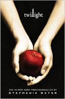
For example, take a look at the cover for TWILIGHT. I think it’s brilliant but how in the world did somebody come up with the concept?
Well, I’m certainly not going to be able to reveal any secrets there but I can give you some insight into how at least one cover was made.
My client Marianne Mancusi (THESE BOOTS WERE MADE FOR STOMPING) is a Producer at Better.TV and she just did a segment on C.L. Wilson’s new cover for her upcoming sequel to LADY OF LIGHT AND SHADOWS.
Click here to check out the video for an inside peek. This cover isn’t even up on Amazon.com yet so you are seeing it here first.
(Cheers to my agent friend Michelle Grajkowski and her client!)
That’s so funny that you bring that up today…I spent ALL last weekend reading the Twilight series, much to the chagrin of my husband and children. It was too good, I couldn’t sleep. But I kept wondering about the covers, turning them over in my hands, thinking, “I don’t know where that came from.” Except maybe the whole Eve thing, her blood being the forbidden fruit? Must…not…go read…again!
I love Marianne Mancusi’s cover…very vibrant. Thanks for the insight.
I don’t actually find this cover that eye-knocking. It seems to slavishly follow the current convention of showing disassociated body parts on fiction covers.
Whole People, Unite!
The colors on that cover are captivating…the blood red of that apple really stands out (it’s probably not the done thing to describe food in terms of blood, but anyway…)
I’d love to see focus group results of different covers, particularly to see if they sync up with actual sales figures.
Among the several jobs I had at one time or another was “Printing and Publishing Officer” and all that meant was that I got to send things to a printer and receive the proofs back. I was a glorified clerk (yawn). However, once two delightful engineers came to me with their own cover, all designed and laid out in Photoshop) and they insisted I take it to the graphics artist.
Well of course it wasn’t right – It was the wrong size and number of pixel per inch for printing. The engineers described a color that I didn’t see on my computer. (all monitors show different colors).
I can’t tell you how many hours the graphics artists tied me up with complaints. It didn’t have a true black. It didn’t have a true white. It wasn’t a color in the book of colors. Was the design copyright? Or would it be copyright?
I never did that again. I will never do that again. I have no talent for cover art and I’m happy to have a graphics artist do the work.
Is anyone else having trouble reading the clickable light green tags on the white page? It looks fine on the purple, but it’s difficult to read on white. Just wishing Kristin might consider changing it to a slighty darker color. Thanks!
I agree with Deb. I am not a huge fan of the ‘body part’ book covers. But, thank you for this sneak peek! It was great to see a little about how author’s create their covers.
I love this cover, and it fits in nicely with the Bible verse Stephenie quotes at the beginning of the book.
However, it’s a good thing Twilight was so damn good and a best seller, because the covers for New Moon and Eclipse were B-O-R-I-N-G!!!!
From stepheniemeyer.com:
“The apple on the cover of Twilight represents “forbidden fruit.” I used the scripture from Genesis (located just after the table of contents) because I loved the phrase “the fruit of the knowledge of good and evil.” Isn’t this exactly what Bella ends up with? A working knowledge of what good is, and what evil is. The nice thing about the apple is it has so many symbolic roots. You’ve got the apple in Snow White, one bite and you’re frozen forever in a state of not-quite-death… Then you have Paris and the golden apple in Greek mythology—look how much trouble that started. Apples are quite the versatile fruit. In the end, I love the beautiful simplicity of the picture. To me it says: choice.”
I always thought exactly what anonymous, above, confirmed from Meyer’s website: the fruit of knowledge, with the added addition of that luscious picture implying the choice that hinges around one monumental bite – which turns out to sum up a lot of the conflict for Bella, doesn’t it?
I am going to have a toast in my own honor: it’s taken about five weeks of steady reading, but I’ve finally caught up on your blog after starting from the beginning!
It has been an education and a pleasure. And I hope you have an LJ feed. 😉
Most covers would probably look different if the author was intimately involved with the design instead of, mostly, being handed over to marketing, who ‘have greater experience’. What do you think?
I like the cover. For me, it gives just enough to make me want to pick up the book and check it out.
CL Wilson’s covers are amazing, but then so are her books.
Thanks for posting the link, it was cool watching the process.
I found all the Stephanie Meyer covers to be beautiful, and my teenage girls and their friends have all recently joined the millions of Edward groupies 🙂
I really enjoyed Marianne Mancusi’s piece on the making of the QUEEN OF SONG AND SOULS cover, and it is quite illuminating to realize how swiftly and effectively a cover must “do its job” to attract a reader.
That’s where the dramatic simplcity of the Stephanie Meyer covers really pop and make them stand out on the bookshelves.
I think people who can come up with great covers have a gift. Like those who can come up with great titles.
We all have our strengths and I think a good publishing house will let people who are gifted do their job.
Omigod, I can’t actually believe Meyer had to explain that to the world. Is there anyone actually out there not already oversaturated by the woman with the apple Sunday-school-level symbology?
From this thread, apparently so.
Geez. Maybe for the next one we’ll read how the skull-and-crossbones signifies impending danger, with the possibility of fatal consequences.
While I’ll grant the photography and design are fine, from a visual arts point of view, it is the most-hamfisted cliche imaginable.
I grinned when I saw that you used this cover as an example. I’ve been telling everyone how much I LOVE it.
The moment I got the book, I shoved it in my husband’s face and screamed, “Is this just the most amazing cover or what?! Its graceful, elegant, stunning in simplicity!My god,what beauty!”
To which he replied, “Uh…yeah.”
The powers that be definitely went the right direction with this one-no cheesy pics of vampires, etc.
Kristen, I love your blog. Would you do a post on how an author could have control over his/her cover? The thought that all one’s effort could be jeopardized by someone else’s artwork is terrifying to me.
Thanks for all the good work you do for authors in the trenches!
I went to an excellent panel on covers at the World Fantasy Convention last November in Saratoga Springs. One reason it was so interesting was much of it was from the artists’ point of view. For established authors who sell based on a proposal, they often have to work with only a sketchy (pardon the pun!) idea of what the story is about! The panel also did not entirely agree with the fans in the audience, who wanted the cover to represent what the book was about and/or what the protagonist looked like. The art directors wanted the cover to make potential readers buy the book. Everyone agree that the cover should provide a clue to the feel of the book without giving too much of the story away.
While I’ll grant the photography and design are fine, from a visual arts point of view, it is the most-hamfisted cliche imaginable.
I think what prevents the cover from sliding into a trench of triteness is the title. TWILIGHT has nothing to do with Eve, Snow White, etc. If the title was something like FORBIDDEN or TEMPTATION, then yeah . . . too obvious.
TWILIGHT has been on display at my B&N for a couple of weeks now, and every time I pass these books, I have to stop. I think the cover is so visually arresting.
I was talking to an agent in the UK and he told me that many of the big publishers have representatives from the big retailers sit in on the meeting to decide the cover. So Tesco (a big supermarket that sells a lot of commercial fiction) can sit in on the publisher’s internal meeting and tell them that they want a pink cover. It’s a horrifying thought, but I guess it brings it home that books are just products at the end of the day. Does this happen in the US?