STATUS: Happy Halloween!
What’s playing on the iPod right now? GHOSTBUSTERS by Ray Parker
It’s not often you get a glimpse of the behind the scenes discussion about a cover but there were quite a few interesting points for this one.
1. Cover image. Did we want iconic (a la TWILIGHT) or did we think that had been done to death?
Now, I have to say that I’m often drawn to iconic image covers but when you look around on shelves right now, there are an awful lot of them.
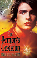
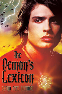
So when the Art Director suggested actually having a model shoot to do an image of Nick for the cover. We were intrigued (nervous too because how often does a real human depiction of a character seem right?). We reviewed the models in contention before the cover shoot took place (it’s a hard job, I know, but somebody has to do it!).
For Sarah Rees Brennan, this model was hands down the winner. It was pretty dang close to the Nick she envisioned.
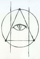
2. Demon Mark. This plays a huge role in the story so Sarah did a nice drawing of how she envisioned it in her head. S&S didn’t end up doing anything with the image but they did play around with the idea.
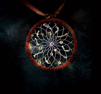
3. Talisman. If we had gone the iconic image route, I imagine this would have been featured somewhere on the cover. S&S designed the beautiful talisman themselves and created it for the cover shoot. Here’s a close up shot.
4. The Menacing Birds. The Art Director just loved them so we knew they’d make the cover. There were, however, several variations of them but here you see them in their final form.
.jpg)
.jpg)