STATUS: Happy Halloween!
What’s playing on the iPod right now? GHOSTBUSTERS by Ray Parker
It’s not often you get a glimpse of the behind the scenes discussion about a cover but there were quite a few interesting points for this one.
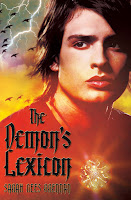
1. Cover image. Did we want iconic (a la TWILIGHT) or did we think that had been done to death?
Now, I have to say that I’m often drawn to iconic image covers but when you look around on shelves right now, there are an awful lot of them.
So when the Art Director suggested actually having a model shoot to do an image of Nick for the cover. We were intrigued (nervous too because how often does a real human depiction of a character seem right?). We reviewed the models in contention before the cover shoot took place (it’s a hard job, I know, but somebody has to do it!).
For Sarah Rees Brennan, this model was hands down the winner. It was pretty dang close to the Nick she envisioned.
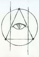
2. Demon Mark. This plays a huge role in the story so Sarah did a nice drawing of how she envisioned it in her head. S&S didn’t end up doing anything with the image but they did play around with the idea.
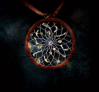
3. Talisman. If we had gone the iconic image route, I imagine this would have been featured somewhere on the cover. S&S designed the beautiful talisman themselves and created it for the cover shoot. Here’s a close up shot.
4. The Menacing Birds. The Art Director just loved them so we knew they’d make the cover. There were, however, several variations of them but here you see them in their final form.
.jpg)
Cool cover and post—this is the first post I’ve seen which discusses the “making of a cover,” so thanks for it.
And wasn’t that just the best CO trick-or-treating weather ever?!
This is exactly the kind of insight into publishing I find fascinating, but hardly ever see. Thank you!
Interesting. Thanks for posting that.
I was told on another agent blog that authors almost never get ANY input on what they want their book covers to look like. But it seems like Sarah Rees Brennan had a lot of say in this! This encourages me (I’m very specific about what my characters look like, etc). Does an author’s input on the cover art depend on the genre (as the author who answered my question on the other blog suggested)? Is it rare?
To God be the glory,
A SF writer
Strangely, the last three YA book covers I’ve seen, including this one, for 2009 are all big huge models’ faces. Looks like the iconic image trend is now moving to the ‘big face’ trend.
Nice cover, but I was hoping for something darker and more ‘demon-y’. Not like I have much of a clue what the book is about beyond what I’ve read on here, though.
I really don’t want to leave a negative comment but I find it fascinating just how different people’s perspectives of art and professionalism can be. Regardless of what I may think, one can’t argue with an initial print run of a 100,000 copies.
Hey, I posted my new short story at acreofindependence.com; halloween flavor, check it out!
Is this YA? I thought it was a romance novel, by that cover.
You might have a heck of a time gaining male readership for this. What 16 year-old boy is brave enough to walk to the register and buy a book with a “pretty” boy on the cover? Not many.
Though I’m sure all the free publicity on this site and others will win over the girls, so who cares, I guess…
Sheesh, that looks a lot like my oldest son.
It’s nice to know once in a while there is some input about the cover. I won’t hold my breath about mine when it sells.
I keep thinking about the woman who wrote a western mystery that had the most horrific mockery of a cover I had to tear it off to read the book.
Usually I like iconic covers better, only because I like to picture the characters myself, but this one is cool. I can’t complain about a guy that handsome 🙂
I read the first chapter of Demon’s Lexicon on Sarah’s site and thought it was fantastic. It was scary, funny, and lyrical (three of my favorite elements in any story :). I have my fingers crossed for a little bit of a love story too. Based on some clues on chapter one and the cover here, I don’t think I’ll be disappointed. 🙂 I can’t wait to read this book! Thanks for getting it out there.
Hmm, didn’t really think about it until Anon 8:02 made the observation regarding boys buying a book with a ‘pretty boy’ on the cover. As a male, gotta agree with Anon…I find it hard to believe that boys will pick this YA book up at the store…unless they can get their mom or kid sister to buy it for them. I would have opted for the iconic cover with the medalion…just one guy’s perspective, but I suspect you may have abrogated a certain percentage of potential readers with that cover.
This is actually cool, because it’s the second time I’ve gotten some insight about cover art in the last couple of weeks. Sean Chercover had a guest post over a http://www.murderati.com and gave a link where people could see (and vote on) all of the potential covers vs. the one they finally chose.
Oh, and Ms. Nelson, I kind of agree about iconic covers. I’ve always been one for the “big book” cover myself. But that’s just me.