STATUS: It’s been some late nights this week and trust me, my proofreading skills are abominable when I’m blogging regularly, just imagine what it would be like if I were blogging at 1 a.m. London time.
What’s playing on the iPod right now? ENGLISHMAN IN NEW YORK by Sting
And no, this isn’t the Battle of the Titans. What I’m learning is just how different these two markets actually are. Intellectually I know this (and have always known this) but I also think we like to lump it all together and say, hey, we all speak the same language (although the Brits might argue that point) so if we share the lingo, shouldn’t we share the taste? For some books, yes, this will align and match up but for a slew of other books, we couldn’t be further apart even if the ocean was wider between us.
To get a sense of the retail environment, I decided to check out the Borders at Oxford Circus, the Waterstone’s at Piccadilly Circus and then I popped by a Books etc. at Hammersmith. I’m not saying that this is fair representation of all the stores in town; it’s just the ones I managed to visit while I was here.
I took some notes on my observations and then shared it with all the editors I’ve been meeting with this week on both the children’s and the adult side of publishing. If I covered everything in one entry, this would be one heck of a long blog so I’m going to start on the children’s side. I’ll also try and do a couple of entries over the weekend to make up for my general radio silence this past week. Starting on Monday, it’s back to full days and spotty blogging.
So what is clear to me:
1. Boy adventure books are prime time in the UK. Eoin Colfer’s AIRMAN and the young James Bond books. It’s not to say those didn’t do well in the US, they did; however, shelf space, front table displays, etc. is all about the boy adventure books here in the UK. I wouldn’t say it’s getting equal time in the US. And another interesting tidbit. Sometimes wild success in the US does not translate completely over to the same success in the UK.
For example, Robert Muchamore and the Cherub series is big, big, big in the UK. They did do a US version and it hasn’t taken off as much as they hoped. In reverse, Riordan’s Percy Jackson & The Olympians series is big, big, big in US and although it’s seems to be growing in popularity in the UK, it hasn’t been quite the phenom it has been stateside.
39 Clues. Not making a dent in the UK market.
2. Some books nail both sides of the pond with equal success. Can you guess at the two titles with matched overwhelming success? One primarily has female readers; the other mainly male readers.
Oh, I’m sure you guessed one right off the top of your head and you’d be right. TWILIGHT series is equally popular in the US and UK. Interestingly enough, so is DIARY OF A WIMPY KID.
Rather cool, wouldn’t you say?
3. Another interesting observation at the UK bookstores that I wish they’d do more of in the US. All three of the UK stores I visited, did crossover shelving in the children’s and adult areas. Here are three titles that were shelved in both sections:
a. Twilight
b. Graceling
c. Harry Potter
The Harry Potter books even had different, adult covers. There might have been more titles but those were just three that I managed to glimpse while browsing the book stalls. I love that. I don’t think I’ve seen a teen book shelved in the adult section of a US Borders, BN, or even at the Tattered Cover. I could be wrong as I just might need to pay closer attention but it looked like it was rather common practice here in England.
And last but not least for this entry, US and UK covers couldn’t be more different if you tried. For example, I was showing editors my upcoming titles that will be releasing in the UK this fall. I had both the US cover and the UK in my portfolio for people to see, pick up, look at cover copy etc.
For Helen Stringer’s SPELLBINDER, all the editors said, “ah, yes, that’s a totally US approach. That wouldn’t work over here.
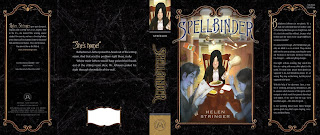
And then when I showed the UK cover, all their faces lit up and they really oohed and ahhed over it. They couldn’t help themselves and had to pick it up.
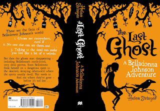
That was absolutely fascinating to me! These two covers, the titles, the approaches are radically different as you can see.
Let’s hope that both sides of the pond are right in what kids will reach for when the book hits shelves.
I always find this topic intriguing, and I would guess, with other countries that do NOT share our language, it is even more diverse. For example, I know an author who has a great science fiction series out. It even won a major U.S. award for the first novel in the series. But it hasn’t done as well in sales as the publisher would have liked. Now, it looks like the third book may not be made available in the U.S. But it will be out in Germany.
Well, that’s just great for the readers who are enjoying it but don’t speak German. My maiden name is Troidl, but my German is very rusty. Sigh.
Hi Kristin,
I love hearing your analysis on NA vs UK markets. Looking forward to learning more.
I find the subject really interesting, mostly because as an author for Harlequin Historicals/Mills and Boon, my books are released on both sides of the pond. They are exactly the same book, but the differences in the covers are fascinating! I show them side by side on the books page of my website because I think readers really enjoy the contrast.
Thanks for sharing your impressions!
Very interesting about the UK market. Thanks for sharing.
P.S. I absolutely adore Helen’s UK cover. I like it better than the US version. (Don’t ask why because I can’t explain it, and I’m not British either…)
The differences between the US and UK/Ireland book trade are always fascinating to me. It’s got to the point where I can recognise the preferences and attitudes towards covers and marketing and how they would appeal on either side of the pond. I don’t always understand them, but it’s interesting to pinpoint and acknowledge them.
I’ve always seen Twilight and Harry Potter shelved in both adult and children’s sections of my Borders in Chicago. It’s there right when you walk in on the Bestseller stands and up the stairs in the Children’s section too.
Kristin, IMHO,
Brits speak English. We speak American… a dialect of English.
Haste yee back 😉
In some respects, the Atlantic is the gateway to an alien world, whichever way you fly or sail over it — and especially if you accidentally land in Belgium.
As for the book — I’d definitely choose The Last Ghost every time. So hats off to the marketing team on that score.
Thanks for this insight, and hope the week is going well for you. Looks like it is.
I agree with you that it’s interesting to see the differences in tastes in the two markets. I’m British but have been living in the U.S. for years (my husband’s American), and even though there are a lot of similarities, there are some big differences in our cultures, which could explain the root of the differences in book tastes.
As for the covers, I really love the U.K. version. The U.S. version is nice, but it doesn’t stand out as much to me. What’s fascinating is that they’re the same book. You’d never guess that from the covers and names. The covers and names seem to imply very different stories.
Knowing the story itself, which do you think best shows the book’s content?
Thanks, again.
Kristin wrote, “The Harry Potter books even had different, adult covers…. I don’t think I’ve seen a teen book shelved in the adult section of a US Borders, BN, or even at the Tattered Cover. I could be wrong as I just might need to pay closer attention but it looked like it was rather common practice here in England.”I’m an English writer and used to be an editor, and I can agree that there’s a lot of crossover between YA and adult sections in the bookshops here: and while not all books get the luxury of two covers, one for each, as the Harry Potter ones have, several books have crossover covers which don’t stamp them as exclusively one or the other. I wonder if that’s what’s reposnsible for at least part of the difference between the two editions that you show in your post, Kristin? That US one just wouldn’t work in the adult section at all (unless it was a pastiche, for example, or a satire–consider Jasper Fforde), while the UK cover would be at home in both.
Ooops. There should have been a paragraph break in that somewhere… it must have fallen off while I traversed the Atlantic. Sorry!
Quite fascinating how the Eye of the Beholder varies per region, isn’t it? And thank heavens that variety exists or the world would be a terribly boring cookie-cutter kind of place.
Not that worldwide product marketing much appreciates having to create locale-specific offerings. The one-size-fits-all approach will always yield the lowest cost of sales, but then, will you actually get those sales?
Try not to let the proliferation of exported American fast food joints detract any from your UK stay. Safe travels.
I like the Brit version of the cover much, much, much better. In fact, with the Brit version, I’d totally pick up that book.
But I thought that might be an adult appeal, so I showed it to my daughter and my friends’ kids (who are over today), and they all picked the yellow cover too. (ages 12, 10, 8, 6, and 4)
Maybe we need to shop imports. ahahahaa
Very interesting. I like the first cover. The second is good as well, but I must admit, I’d pick up the first one and not the second. This makes me very curious about what really draws in a British audience. Something fascinating to contemplate, thanks!
Very interesting. From a UK perspective, the first cover made me think Lemony Snicket rip off. The second cover looked more original.
I’m glad to hear that Robert Muchamore isn’t so popular in the US because I hate those books. So sleazy!
One thing I notice here in the UK is how girls’ books look like mini chick lit – pink and sparkly. Is that the same in the US?
Very interesting blog, confirming my long-suspected belief that the UK and the US really are, nevermind a tiny ocean, WORLDS apart in terms of publishing. I’m surprised that the adult-editions of Harry Potter didn’t make it across the Atlantic, I assumed every country had them!
And (as a Brit!) I love the second cover so, so much more. Although that may be because my favourite book(s) as a child were a collection of fairytales, all illustrated in that silhouette-style. I love it, I think it’s completely beautiful.
Kez said the first thing that came to my mind–the American cover looks like an attempt to capitalize on Lemony Snicket. The elaborately framed window view of the scene, and the style of the illustration, look that way to me. That led me to wonder whether the same artist was used, and also to wonder whether American audiences prefer that kind of familiar feel.
I, too, would choose the UK cover over the US, but I don’t know that I would pick it up, if that makes sense. So maybe I’m not close enough to the “target” to give a reliable opinion.
Kristin, now that you’ve shown us the covers, can you give us some insight as to why each looks the way it does?
Instead of seeing books in the US shelved in both the adult and children/YA sections, I usually see the big enough hits on an end display or getting table space. This is definitely the case for the Harry Potter and Twilight series here.
I rather like both covers for Stringer’s book! When it comes to the dual UK covers, I find that I like the adult versions, but the children’s versions are too much for me. (I’m rather hit-or-miss on the US covers, but I like more of them than not.)
There’s a moral panic over here about boys falling behind girls in school, and boys not reading, et seq, which probably explains at least in part the big push on books for boys.
This is very interesting. This week I had a British editor contact me with revises for a previously pubbed story that was released in a US book. When I read her changes, and saw the British style she’d added, I told her not to change a single thing she’d revised. They were only small changes, but I liked the extra flavor she’d added.
Great post! As a Canadian who grew up on BBC programming and myriad other British influences, I’m not at all surprised at the disparity in the publishing industry, but it’s still fascinating to see how the cultural differences translate into the marketplace. No pun intended 🙂
I adore the UK cover, although, if we’re going to complain that the US cover is echoing Lemony Snicket, we should acknowledge that the UK cover seems clearly to be emulating The Book of Lost Things.
Which I actually bought on the basis of its cover and title alone (and, sadly but perhaps predictably, was disappointed in).
Romance covers are very different as well. Here in the UK they tend books have classic “bodice ripper” poses. The UK ones draw far less attention on the tube.
I would love to hear your views on the romance market in the UK.
(I hope this isn’t a double post)
I find the UK title and cover art to be far more evocative. The U.S. cover isn’t really a grabber to me–kinda blah. The slugline–“A Belladonna Johnson Adventure”–indicates that it’s the start of a series. Kids like that–(Hell, so do I—I have all the Vesper Holly novels by Lloyd Alexander in hardcover and I give sets to kids whose heads I want to feed).
I think the U.S. title may be a handicap—it doesn’t stand out. On Amazon alone there are more that 1200 books with “Spellbinder” in the title.
Sadly, I had to look at both of the covers for a bit to realize they were the same book! With the difference in name, it was difficult.
I like the British cover more, too. Sorry, US cover.
Could you post bigger pix of the jackets? Even with trifocals I can barely make out details.
I bought the adult cover special edition of the Potter series, ordered from UK Amazon. (I wanted the original UK English, mostly, but I did like the covers.)
However, I admit of the two covers above, I much prefer the US version.
Within historical romance, Julia Quinn and Eloisa James have completely different covers for their UK editions. For Quinn, the covers play up a cheeky, ironic tone, whereas for James, the UK covers for her Desperate Duchesses series say “historical fiction.”
I find the UK v US market very fascinating as a writer of historical romance because despite the worldwide appeal of the genre, it seems that very few HisRom authors sell to UK publishers (as opposed to UK readers purchasing US editions on amazon UK).
I’m a library assistant in an American high school, and we’ve got all of the Cherub series by Robert Muchamore. Many of the series we have in our collection have a lot of checkouts for the first book and declining checkouts for subsequent books, but Muchamore’s books seem to keep their readers. The guys who I’ve recommended the first one to have come back to pick up the rest of the series, and after reading them I can definitely see the appeal.
Yes, the main character is sleazy, Kez, but it’s easy to see where he’s coming from and that the author isn’t approving of his actions or those of some of the other teens.
I was surprised to see the other day that while my local library also has the books (and they’re constantly checked out, as far as I can tell) the local Barnes and Noble doesn’t carry them in the store.
I will say that I don’t think it’s a great bookstore and that they do a terrible job of marketing YA or genre books, but perhaps that’s also part of the reason the Cherub books aren’t as popular over here? I don’t think it’s the covers or the writing. The books resemble one of the series by Anthony Horowitz that’s pretty popular, so that just doesn’t make sense.
Forgot to add my comment on the Spellbinder cover: I’d choose the UK cover. The US cover is too busy and too dark. The orange background and the black silhouettes on the UK cover are suitably creepy and give me a Tim Burton vibe.
Further to my earlier comment I just got back from a night out in London and had a look in the Islington Waterstone’s window – the silhouette cover looked just like two books on display there – similar style, lettering everything! So yes, it’s not just Lemony Snicket that’s being emulated.
I just read one of the Robert Muchamore books and I hated it, but it was mid-series, so I know nothing about the character, to be fair. I do like the Antony Horowitz Stormbreaker series.
Living in Australia, I often see books from both the UK and US. I’ve found over the years I can tell them apart just from the covers (fantasy in particular).
I once took a visiting US friend to the bookstore to buy a book (one of Robin Hobbs Farseer series I think). Only the UK version was available, and he said that if he hadn’t known the author and book he wanted he would never have picked it up – the cover was just totally wrong for him.
The cross-over books with separate covers is pretty common. Other dual cover books in the UK are The Graveyard Book and all the His Dark Materials books. In the other direction, The Belgariad (David Eddings) is available with young adult covers.
(And I like the yellow cover better… it reminds me of the The Worst Witch).
Yes, in Australia we often do get books with both sorts of covers. Another interesting point about the Australian market is that it doesn’t entirely echo any other market in the world.
For example, although the big favourites are frequently good sellers also – Twilight and Harry Potter – there have been very few other dark urban fantasy books here. We’ve been spared the bulk of the werewolf/vampire/shapeshifter releases. I mean, sure, there are one or two authors on the shelves – Laurell K Hamilton and one or two others – but in general that craze skipped us by.
What Australian fantasy readers can’t seem to get enough of – and rarely find – is the big fantasy novels like ‘The Name of the Wind.’
Why aren’t we getting enough? because we’re starting to get market bleed over from America or the UK. Which means… *sigh* a new raft of urban fantasy novels seeping on to our shelves. I guess the sales results will soon demonstrate the folly of that as a marketing plan…
Hmmmm. I like the UK cover much better.
When I saw the US cover it screamed fantasy to me. And although I love Harry Potter, I don’t like much other fantasy. The UK cover with its “A Belladonna Johnson Adventure” tagline seemed more character driven and fun.
I would never have picked up Spellbinder, but I definitely would have picked up The Last Ghost. And I never would have guessed they were the same book.
Very enlightening. Thanks!
Pat Zietlow Miller
Very interesting to see what works in what countries.
And while I like both covers, I think I like the UK one a little better. 🙂
I love the UK one MUCH more. That I would pick up in a heartbeat. The US one…I wouldn’t even be interested in checking it out, looking at that cover.
The UK title is worlds better. The cover art is eyecatching, though I don’t personally care for the color scheme: it looks Halloween-themed.
The US cover and title are more forgettable.
And I’m wondering if they completely missed the mark on that one, since so many of your US readers don’t like it.
Halloween theme not so obvious in the UK, because we don’t do Holloween to the same extent.
I love the UK cover and I’m born and raised “Yank”, it would draw me as a 26 year old woman from across the room to look at it. It reminds me of my favorite creepy kids books from when I was a child.
I second Kristen–I’m in the US and I much prefer the UK cover art. It’s more evocative and leaves a bit more up to your imagination, and sort of has a slight creepiness/mystery to it (it does definitely have a whiff of John Connolly’s “Lost Things” about it, though). The US cover looks cheap and tacky by comparison.
You want to talk real differences, though, try comparing French book covers to US ones. I loathe most French book covers, even though I enjoy the writing.
I love jacket covers – the art and the title and the marketing and *all* of it is so interesting to me. It seems as though most everyone above prefers the UK cover, and I agree – I find it far more appealing. It has a creepy/kooky feel, like a funny ghost story. I’d definitely pick it up to see if that was indeed the case. I doubt I’d be interested in the US cover, because I’m not a huge fantasy reader, and that cover says little else.
I FAR prefer the UK cover. The American cover doesn’t do a thing for me. Interesting.
Is there a Canadian cover? We spell colour with a U, too. If we’re voting, as a Canadian, I want the UK cover and title. 😉
Both of those covers would grab my interest. Both equally gorgeous to me.
You should definitely go to Foyle on Charing Cross Road next time. It’s huge and still independently owned and it’s where all the Londoners like to shop.
There’s also a big Borders and a Blackwells on the same strip. The Blackwells has a new print-on-demand machine in store.
I was wondering if there is a difference between the Adult and Children editions from Amazon. I recently bought The Graveyard Book by Neil Gaiman from amazon.co.uk and I am finding out that it is the latter of the two. Thanks! ~SAM in NYC
I’ve noticed the differences in covers as well. For the most part, I’m not a huge fan of the UK’s take on things, but with this The Last Ghost, I think the UK cover is more attractive. I’m definitely into the artsy things!