Pub Rants

Category: covers

Cover Design In 2 Minutes

STATUS: There’s a lot of cool stuff going on today but I’m only allowed to talk about one of them. See below.

What’s playing on the iPod right now? PRIDE & JOY by Stevie Ray Vaughan & Double Trouble

Sometimes a Publisher will put together a really cool promo for an author. And in general, I have to say that the Orbit team is one of my favorites to work with—especially publicity guru Alex. He’s the one that came up with the SOULLESS paper doll promotion. (I’m not biased or anything as he was NLA’s marketing director Lindsay Mergen’s assistant back in the day….Grin).

He, Lauren and Eric of the fab Orbit team (huge thanks!) came up with this just incredible promo—a video montage that compresses hours of labor into 2 minutes on the making of the cover for BLAMELESS—Gail Carriger’s third book in the Alexia Tarabotti Parasol Protectorate Series.

Love Orbit! Galley Cat and Huffington Post have already picked it up.

Check it out.

And for fun, here’s the ‘oops’ first draft of the cover. If you watch, you’ll learn exactly what was the mistake in draft one.

What A Difference A Cover Makes?

STATUS: I used to think August was a slow time in publishing. Hum…we seem plenty busy.

What’s playing on the iPod right now? CAN’T HELP FALLING IN LOVE by UB40

Those of you who read my monthly newsletters know that I belong to a book club. (One good reason to be reading outside of my client manuscripts!) I also always get asked the question of whether I have time to read for fun. As of late, not much but that just motivates me more to read what my Book Club has chosen for our next title.

So this evening I was popping online to read a little bit more about the book that we have chosen—which is SWEEPING UP GLASS by Carolyn Wall.

When I first did the search on Amazon, up popped an image that was unfamiliar to me. I had read the Publishers Weekly starred review for this book (which is how it was brought to my attention), but I hadn’t ever seen this cover.

Thank goodness as I don’t think I would have even brought up this title to my Book Club if I had seen this first.

This cover may speak to you but I have to say that it was a real turn off for me. If I had seen this first, I might have passed on recommending this book as a possible read—even with the starred review.

However, I hadn’t seen this cover until I was goofing around online this evening. Here is the cover that I saw for this title.

It’s a redesign done for the trade paperback edition.

So of course I have to ask you folks what you think. Read the description of the novel first and tell me what cover would have made you pick up the book. And I realize that this is all subjective based on individual preference etc. but I find it fascinating all the same.

Speaking Of Bad Covers

STATUS: I’m heading to Red Rocks tonight for a concert. I want the rain to hold off. It never rains in Colorado—except for this summer and on the evenings I have a concert in an open venue.

What’s playing on the iPod right now? LEAVIN’ ON YOUR MIND by Patsy Cline

Today, an editor emailed me to say that I was going to get the publisher’s catalog in the mail but not to freak out regarding the cover for one of my author’s titles.

This is never a good sign.

The editor went on to say that the picture was a place holder for the catalog only and that the cover was changing.

Good to know. So of course I email back and request that they send me the jpg of whatever cover they used in the catalog so I can be prepared (and so I can prepare the author).

The editor does.

Oh my. Truly a hideous cover. I’m so glad the editor emailed to say that it wasn’t going to be the final cover, don’t worry about it, she hates it too, it’s changing.

And no, I can’t share it on the blog (however sorely tempted).

I shared it with my marketing director, Lindsay, and we just had a moment of commiseration. Sometimes you have to wonder what the art department was thinking because honestly, I can’t imagine who thought this cover was okay. I’m not even a design person (really, it’s not my strong point) but even I looked at this and went, uh, no.

There’s no symmetry, no beautiful colors, not even an interesting person on the cover. Bland would sum it up.

But hooray, this isn’t the cover. The editor called us both to talk concepts and ideas and get our input. Love that.

So, I won’t worry unduly. That is until I see the next jpg. Grin.

When Cover Art Goes Bad—Guest Blogger Brenda Novak

STATUS: Woot! Only 128 emails in the inbox. Two contracts on the verge of being finished up. Two projects on the verge of being optioned for film. Not a bad week.

What’s playing on the iPod right now? SAILING by Christopher Cross

As you know, publishers are doing a lot of cost-cutting measures and belt tightening in this tough economy. I certainly understand that. One casualty of all this though is the disappearing cover flat.

It used to be that before any original trade paperback or mass market edition pubbed, the publisher would send out to the author and agent at least 6 to 10 cover flats (sometimes more) so we could review the final cover. Generally admire it. And for the author, use them for promo.

Those were the days. In the last year, I’m lucky if I get one (1) cover flat to review before publication. More often than not, I’m only getting a copy of the book with the final cover, hot off the press, about two weeks before pub.

Now if everything is sailing smoothly, this is no big deal. However, if there is a large snafu as detailed in the cautionary tale below, we’ve got a problem, Houston.

Author and agents always see a jpg of the cover early but as you can tell by Brenda’s story, just seeing a jpg can’t substitute for seeing the final cover art in the flesh so to speak.

So my advice for you published authors (and agents) out there? Make sure you see a copy of the finished book or a cover flat in enough time before pub to problem solve if that becomes necessary.

So, from NYT Bestselling author Brenda Novak….

What’s an author to do….

You work hard to write the best story you possibly can. You polish that manuscript through three rounds of edits. You give cover art and back cover copy input. And you partner with your publisher to put a marketing plan in place that is costing you both a substantial amount of money. At this point, you think you’re finished–finally ready for the book to be released. And this isn’t just any book. This book is the fulfillment of your fondest dream, the first to have “New York Times Bestselling Author” emblazoned above your name.

And then you get your author copies and realize that there’s a serious problem.

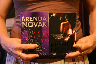
This just happened to me. My author copies arrived less than four weeks before THE PERFECT COUPLE was due out. Eager to take a peek at the real thing, my husband got to the box first and opened it. Then he held my eagerly anticipated book in one hand—and frowned. “Um, honey? Aren’t they going to put your name on this one?” he asked.

I think he’s joking. He’s color-blind, for one thing. I laugh and nudge him to get him to hand it to me. “What are you talking—” I start to say, and then I see for myself. It’s not because he’s color blind that he can’t see my name. It’s because the turquoise foil is so dark there isn’t enough contrast against the black background. Held in the right light, it glimmers and shines and shows up just fine. But place it straight in front of you, and you can’t read “New York Times Bestselling Author” (which is a bit ironic, isn’t it?), my name (even though it’s in a huge font—which would also be exciting if you could see it), or part of the cleverly done title (the “Perfect” part, which is also ironic, since it is anything but perfect). To make matters worse, my agent is out for several days to celebrate the 4th of July, and this book is the first of three to be released in consecutive months. If it tanks, the others could go down like dominos.

At this point, I pictured my career dying a sudden death. LOL Without the help of my agent (thanks to her vacation and the timeliness of this issue), I was forced to do what I could to salvage the situation, but my publisher hadn’t yet seen a copy of the finished book and didn’t even know there was a problem. I dashed off an email to my editor and started the hive buzzing…and buzzing…as they, too, went into panic mode.

Fortunately, I write for a great house and their ultimate decision was to reprint and reship, but I’m sure that wasn’t an easy call to make. It will cost someone (either the publisher or the printer) a fortune. And the process doesn’t happen overnight. Some accounts will respond to the recall, others will ignore it, just as they often ignore street date (I’ve been hearing from fans who’ve read THE PERFECT COUPLE as long as two weeks ago, even though it wasn’t supposed to come out until yesterday).

But will this debacle ruin my career? I hope not. I’m choosing to look at the bright side. Initially, there will be many more of this title in print and, as those with the dark, unreadable foil are collected and destroyed, any that survive…will become collector’s items? Yeah, that’s it. That’s the way to spin it. Everyone wants a book where you can’t make out the author’s name!

The original jpg of The Perfect Couple:


A shot of the unreadable cover next to one of Brenda’s previous books:


New York Times Bestselling Author Brenda Novak has three novels coming out this summer—THE PERFECT COUPLE (7/28), THE PERFECT LIAR (8/25) and THE PERFECT MURDER (9/29), all part of her popular Last Stand Series. She also runs an annual on-line auction for diabetes research every May at www.brendanovak.com. To date, her auctions have raised over $770,000. Brenda considers herself lucky to be a mother of five and married to the love of her life.

US vs. UK

STATUS: It’s been some late nights this week and trust me, my proofreading skills are abominable when I’m blogging regularly, just imagine what it would be like if I were blogging at 1 a.m. London time.

What’s playing on the iPod right now? ENGLISHMAN IN NEW YORK by Sting

And no, this isn’t the Battle of the Titans. What I’m learning is just how different these two markets actually are. Intellectually I know this (and have always known this) but I also think we like to lump it all together and say, hey, we all speak the same language (although the Brits might argue that point) so if we share the lingo, shouldn’t we share the taste? For some books, yes, this will align and match up but for a slew of other books, we couldn’t be further apart even if the ocean was wider between us.

To get a sense of the retail environment, I decided to check out the Borders at Oxford Circus, the Waterstone’s at Piccadilly Circus and then I popped by a Books etc. at Hammersmith. I’m not saying that this is fair representation of all the stores in town; it’s just the ones I managed to visit while I was here.

I took some notes on my observations and then shared it with all the editors I’ve been meeting with this week on both the children’s and the adult side of publishing. If I covered everything in one entry, this would be one heck of a long blog so I’m going to start on the children’s side. I’ll also try and do a couple of entries over the weekend to make up for my general radio silence this past week. Starting on Monday, it’s back to full days and spotty blogging.

So what is clear to me:
1. Boy adventure books are prime time in the UK. Eoin Colfer’s AIRMAN and the young James Bond books. It’s not to say those didn’t do well in the US, they did; however, shelf space, front table displays, etc. is all about the boy adventure books here in the UK. I wouldn’t say it’s getting equal time in the US. And another interesting tidbit. Sometimes wild success in the US does not translate completely over to the same success in the UK.

For example, Robert Muchamore and the Cherub series is big, big, big in the UK. They did do a US version and it hasn’t taken off as much as they hoped. In reverse, Riordan’s Percy Jackson & The Olympians series is big, big, big in US and although it’s seems to be growing in popularity in the UK, it hasn’t been quite the phenom it has been stateside.

39 Clues. Not making a dent in the UK market.

2. Some books nail both sides of the pond with equal success. Can you guess at the two titles with matched overwhelming success? One primarily has female readers; the other mainly male readers.

Oh, I’m sure you guessed one right off the top of your head and you’d be right. TWILIGHT series is equally popular in the US and UK. Interestingly enough, so is DIARY OF A WIMPY KID.

Rather cool, wouldn’t you say?

3. Another interesting observation at the UK bookstores that I wish they’d do more of in the US. All three of the UK stores I visited, did crossover shelving in the children’s and adult areas. Here are three titles that were shelved in both sections:
a. Twilight
b. Graceling
c. Harry Potter

The Harry Potter books even had different, adult covers. There might have been more titles but those were just three that I managed to glimpse while browsing the book stalls. I love that. I don’t think I’ve seen a teen book shelved in the adult section of a US Borders, BN, or even at the Tattered Cover. I could be wrong as I just might need to pay closer attention but it looked like it was rather common practice here in England.

And last but not least for this entry, US and UK covers couldn’t be more different if you tried. For example, I was showing editors my upcoming titles that will be releasing in the UK this fall. I had both the US cover and the UK in my portfolio for people to see, pick up, look at cover copy etc.

For Helen Stringer’s SPELLBINDER, all the editors said, “ah, yes, that’s a totally US approach. That wouldn’t work over here.

And then when I showed the UK cover, all their faces lit up and they really oohed and ahhed over it. They couldn’t help themselves and had to pick it up.

That was absolutely fascinating to me! These two covers, the titles, the approaches are radically different as you can see.

Let’s hope that both sides of the pond are right in what kids will reach for when the book hits shelves.

What We Say When We Talk About Covers

STATUS: It’s been one of those days. It’s almost 4 o’clock and I haven’t even tackled my TO DO for today. Seriously, I think I only get my scheduled work done at the office between the hours of 3 and 7.

What’s playing on the iPod right now? SAY HEY (I LOVE YOU) by Michael Franti and Spearhead

What is said 1: “I’ve shown this cover to everyone here in the office and we all love it. I hope you love it as much as I do.”

What is said 2: “This has been approved by sales & marketing and they just love it. I hope you love it as much as I do”

What is said 3: “We believe our concept is very strong and will really signal that this is a big book. We are excited about the author and these covers.”

Possible Translation 1: Everyone in the office indeed loves it. Sales & Marketing also love it and has approved it. The cover really does rock. It’s new, original, fresh, and innovative.

Possible Translation 2: Editor is worried about the cover but is hoping for the best. That we’ll like it and won’t raise a fuss. There won’t be a cover issue.

Possible Translation 3: That this is really not the greatest cover but time and money have been spent on the concept and the art design/photo shoot and the publisher really doesn’t want to start over. Editor will have a tough road to try and change it.

Possible translation: Editor actually doesn’t care for it but must present it as is. Is hoping we’ll raise a fuss so she can go back to the Art Department and say “see, I thought this was a miss.” Editor then fights strongly for a cover change.

I’ve never had an editor come to me and say, “gee, I think this cover stinks. I think it needs a do-over but what do you think first?”

For the most part, I really do believe that publishing houses and their cover departments have a good handle on the creating of the cover art. That it is their expertise more so than it is mine.

But I don’t believe that publishing houses always know best. If they did, there would never be bad covers. There would never be two covers for two different authors with the same image or the same model on the cover. And released at the same time. There would never be covers that are nixed by the B&N buyer.

The Cover art wouldn’t ever miss.

But it does. Far too frequently.

Consultation

STATUS: Such is the joy of January that the processing of Client 1099s with my bookkeeper is fast upon us.

What’s playing on the iPod right now? SO WHAT by Pink
(and man has this title been stuck in my head all day!)

It’s been awhile since I did a real rant on my blog so what better way to kick off the new year then to treat my reading audience to one?

Agents fight the good fight to get a little clause into author contracts that states that the author will have consultation on the cover and the cover copy (be it flap copy, back copy, or what have you).

For the most part, this isn’t too hard to do and is usually established in the agency’s boilerplate with the publisher.

Great right? Cover consultation means that the author will be consulted on what the final cover will look like. One would assume that it would mean that the author might have some input into what the final cover will look like. And all parties understand that given a disagreement on the cover, the publisher will have final say. [Cover Approval stated in contracts being reserved for the Nora’s, Stephenie’s, Neil’s, Stephen’s, and JK’s of the world.]

Good. Everyone is agreed.

And here comes the rant. But what constitutes “consultation” varies widely from publisher to publisher.

Some publishers send the final cover that can no longer be changed, and say you’ve been consulted. Grrrr. If the cover stinks, I’ve got a big fight on my hands. All of which could have been avoided had we just been really consulted—as the contract states.

Some publishers make you work for the consultation. Grrrr. This means you have to call the editor, email the editor, and harass the editor until you get the cover. It’s frustrating and exhausting and let me tell you, if I have a choice between publishers, I’ll consider this aspect when looking at the two deals on the table.

I do want to state here, in general, most editors really do want their authors to be happy with the cover and so will work with you but the above happens enough to make me want to pull my hair out.

Last week I was chatting with an editor (a big and powerful editor whom I just adore) who has included the author and me on every step of the cover process. From the first conception draft to the “final” draft that went to sales (who then rejected it and then we had to start all over and tackle second draft concepts etc.). And when I was talking to this editor on the phone, I paused and took a moment to thank her for really consulting with us on every step of the process. Not just paying lip service to the clause in the contract but really consulting us. And this for a debut author to boot! [Agents expect this with established authors]. Talk about a sheer joy this has been!

She was startled and said, “Why wouldn’t I? You two have been great.” How I long for every editor to handle it this way. Now please keep in mind this: both the author and I were sane, objective, reasonable, and actually offered good suggestions and because of that, all input was taken seriously. Thus the editor trusted us to work on the cover with her—not against her. This plays a big part in this whole consultation game.

But what I wouldn’t give for the cover process to be just like this for every book I sold. I will make sure that during this process, my author and I are sane, reasonable, and offering good suggestions. Just simply give us the chance.

Cover Tweaks for HOTEL ON THE CORNER

STATUS: Blogging next week might be erratic but I’ll try and hop on to give you the scoop from all my meetings.

What’s playing on the iPod right now? CARUSO by Paul Potts

Earlier this year, I had the pleasure of sharing the cover for Jamie Ford’s HOTEL ON THE CORNER OF BITTER AND SWEET, which releases on January 29, 2009.

Often AREs go out with a plain cover (sometimes blue paper) but RH did the galleys with the actual color cover. Lots of AREs were mailed out for early reviews, feedback, bookseller comments, etc. Now based on that feedback, Random House decided to do a few tweaks. Now I find the whole cover process fascinating so I thought you readers might as well.

For HOTEL, RH decided that the maroon filigree was a bit too heavy and de-emphasized the title. They wanted the title to be more prominent and in bigger font.

So, here’s the original cover.

Here’s the final cover with the tweak.

How A Book Gets A Cover–Romance

STATUS: I’m typing up editorial comments for one of my clients. I was reading all last night. And Sara sent me an email yesterday that a full we requested is hot stuff and I should get reading. Ack!

What’s playing on the iPod right now? CRAZY by Patsy Cline

I don’t know about you but I find the whole book cover process pretty fascinating—especially because I have zero ability in anything artistic.

For example, take a look at the cover for TWILIGHT. I think it’s brilliant but how in the world did somebody come up with the concept?


Well, I’m certainly not going to be able to reveal any secrets there but I can give you some insight into how at least one cover was made.

My client Marianne Mancusi (THESE BOOTS WERE MADE FOR STOMPING) is a Producer at Better.TV and she just did a segment on C.L. Wilson’s new cover for her upcoming sequel to LADY OF LIGHT AND SHADOWS.

Click here to check out the video for an inside peek. This cover isn’t even up on Amazon.com yet so you are seeing it here first.

(Cheers to my agent friend Michelle Grajkowski and her client!)

We Interrupt This Blog Pitch Workshop To Bring You…

STATUS: Excited. CROSS MY HEART AND HOPE TO SPY is still on the NYT top 10 bestseller list for the fourth week. It can’t last forever but I’m going to be happy while Ally is still there!

What’s playing on the iPod right now? I COULD WRITE A BOOK by Harry Connick, Jr.

An awesome cover! Shanna and I got this late in the day yesterday. I have to say I love all the Enchanted Inc. Series covers but this one, this one is just perfect. I couldn’t resist posting.

And sorry to get you all excited because it won’t release until April 2008. Don’t worry. I’ll remind you then.

I also wanted to give a big shout out to a conference that is going to be happening in Denver at the Convention Center the week after next (Nov. 8-9, 2007). It’s an Executive Leadership Development Conference sponsored by the National Hispanic Leadership Institute.

Although most of the topics are about achieving successful corporate careers, there are quite a few workshops regarding publishing. One of them is being given by a good friend whom I met when she was working at Simon & Schuster several years ago. If you live in the area and this applies, you might want to check it out.

From Inspiration to Publication: What Latinas Need to Know About Getting Published
By Marcela Landres

WHAT: Finding the right publisher is difficult for any writer, but Latinas face unique challenges–and opportunities. Topics discussed include: the significance of Latinas to mainstream publishers; writing in Spanish vs. English; dealing with the label of “Latina Writer”; how to find a good agent and editor in a non-Latino industry; overcoming cultural and social barriers; and the most important thing you can do to ensure the future success of Latino publishing.

WHEN: Friday, November 9, 3:30 – 4:30 PM

WHERE: Colorado Convention Center, 650 15th Street, Denver, Colorado 80202

Click here to find out more and if you’d like to register, here’s the link.